1. 
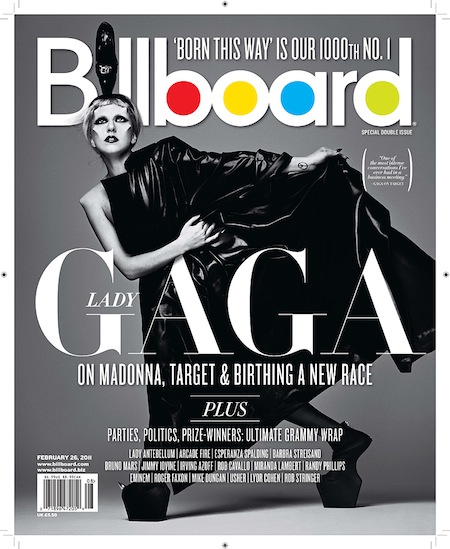
- Billboard Magazine: Firstly, the main viewing point of this logo/header is the Primary colours used to fill the 'B, O, A and D', I think this was used as a tool to catch attention and to make it well know if it is used on many of their issues. The black in contrast with the other colours surprisingly work, however, this could differ when being placed on different covers due to the fact that each magazine cover has various themes to it. The font used can be clearly read, although it is in lowercase, it still stands out and doesn't need to grab attention all the time if it is in uppercase letters. Lastly, others may have other diverse opinions on this title, but it does clearly grab attention with a various of colours relating to all sorts, to which links with the genre of the magazine, various popular/chart music.
- Billboard have had various other logo changes, and change in colours, examples below:


Examples:

------------------------------------------------------------------------------------------------------------
2. 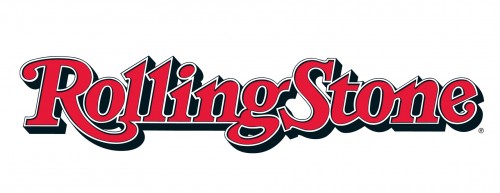
- Rolling Stone Magazine: Firstly, the logo stands out very clearly due to the fact that the only colours visible to the eye is red, and similar to Billboard, it is all in lowercase, excluding capital letters. I think that although it does connote importance, the colour helps do that already. When put on the magazine, I think that again, the same as Billboard, it depends on the colour background chosen if it works as well or that it needs to be changed/on personal opinion. Overall, it's an icon magazine logo to which everyone recognises and overpowers others.

Examples:


------------------------------------------------------------------------------------------------------------
3.

- Interview Magazine: The first thing that attracts my attention is that the title is unusual and in a 'handwriting' type of font. I think that this is a good way of attracting an audience due to the fact that with this type of text, you can change the colour, density and outline of the font so that it can suit any situation on the magazine cover. I think that the continuity of the font choice makes the magazine more noticeable and more iconic, this means that more people will recognise the brand because of the title. The most common colours for the title used on the magazine is Black and White, however, Red and Multi-colours have been presented in a way of making the title stand out from the front page cover. However, this font choice and the colour could be a problem in connect with the type of background chosen for the magazine issue, for example, if the colours clash with the title, it won't be able to be read that well. On the other hand, I think that the text works well with the theme (founded by Andy Warhol, features the world's biggest celebrities, artists, musicians and creative thinkers).
Examples:


Try and add one more magazine title analysis to this post to secure the highest band.
ReplyDelete